Reading the Results Section
Your Guide to Reading the Epidemiological Literature

As a professor of Epidemiology, my primary goal is to teach my students how to read, critically analyze, and apply the results of an epidemiological study to create healthy communities. I want to empower my students to read research papers from beginning to end (not just the Abstract and definitely not skipping the Methods section). I want them to confidently read the literature, determine for themselves the strengths and limitations of the study, and be able to communicate the findings and any applications of those findings to a group of community members without any knowledge of epidemiology.
And I want to invite all of you into my classroom (so to speak). I want to provide you with a guide to reading the epidemiological research and the opportunity to read, discuss, and apply the findings of epidemiological studies with me.
Together — with improved literacy and the ability to see the strengths and limitations that are inherent in every study — we can fight misinformation, spot disinformation, craft strategies to improve health, and create healthy communities.
Are you ready?
Do you want to learn how to read, analyze, and apply the epidemiological literature?
Let’s get started… (if you missed one of the previous posts, start here — Rule #1).

The Results Section comes immediately after the Methods.
The goal of the Results Section is to answer one simple question — what did the authors find? In other words, what are the results of their research? In addition to answering this question, the authors will provide evidence (often in the form of statistics) to support what they have found.
Three things to know before you start to read the Results Section —
In terms of word count, the Results Section is the shortest section of the paper. The authors are expecting you to go back and forth between the text and the tables, figures, and summary graphics they have included in the paper.
Many key findings and specific statistics are NOT in the text; they are in the tables/figures included in the Results Section.At the end of the Introduction of the paper, the authors state their purpose/objective. Before reading the Results, go back to that objective statement and familiarize yourself with it. The results should answer the question described in that objective statement (see example below).
Remember — the Methods are your roadmap. If this is the case, the Results are the photobook made after the trip is over to highlight what was seen/found along the way. Specifically, the results show you who was in the sample, how many individuals met certain criteria/had specific characteristics in the study, and what is the association between the main health outcome and risk factor the authors are interested in.
The Results Section will begin with a summary of the study sample. Usually, the data are summarized in Table 1. For example, remember the study about the effectiveness of the pertussis vaccine? The authors state that their —
“primary objective was to estimate the maternal pertussis vaccine effectiveness in England and Wales in protecting newborn infants against laboratory-confirmed pertussis infection, using a case-control study design.”
In the Results, they begin by telling us who was in their study using a table.
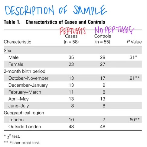
This table tells us that there were 58 cases of pertussis (n=the number in the sample) and 55 who did NOT have pertussis. In this case, the researchers are comparing the characteristics of infants with and without pertussis. Table 1 also tells us a little bit more about the sample — we know the sex breakdown, when the babies were born, and where they live (in vs. outside of London).
Those p-values in the right-hand column tell us that the likelihood that the male/female breakdown between cases and controls could have occurred by chance alone 31% of the time; the birth month breakdown could have occurred by chance alone 81% of the time; and the geographic breakdown could have occurred by chance alone 60% of the time.
In other words, the cases and controls are very similar in terms of sex, birth month, and geographic distribution. This is a GOOD thing. They are similar in terms of all these extraneous factors — so it will allow us to focus on the differences in vaccination status among the case and control groups.
The main result (the answer to the question posed in the Introduction) is usually found in the next table(s) of the Results Section. In the pertussis paper, we find the answer to the question about vaccine effectiveness in Table 2.
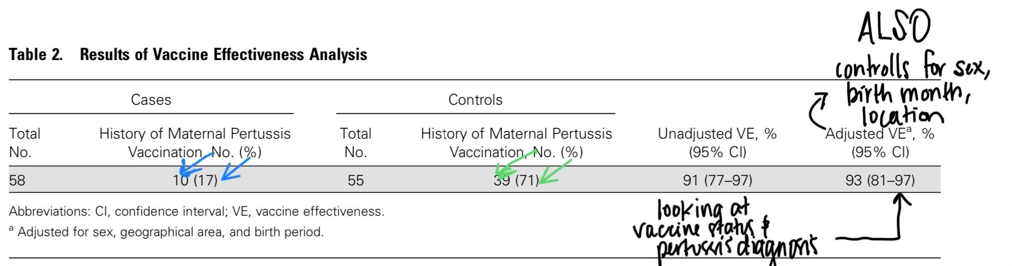
In Table 2, we see the breakdown of cases and controls by maternal vaccine status (blue arrows for cases; green for controls). Additionally, we see both the unadjusted and adjusted vaccine effectiveness.
Unadjusted vs. Adjusted?
The unadjusted vaccine effectiveness1 calculation looked just at maternal vaccine status and whether or not the infant developed pertussis. It is as if the rest of the characteristics of the baby and its risk factors (when it was born and where it lives) did not exist. The unadjusted measure of vaccine effectiveness just looks at the impact of the maternal vaccine.
I like to imagine the unadjusted measure as an experiment in a laboratory where I can isolate one risk factor and see its impact.
Unfortunately — or in reality — this is NOT the case. We are people. We have genes and family histories, we live in certain places, are exposed to different things, we have different behaviors, we have different beliefs, and our access to healthcare varies.
Because of this — we ALWAYS adjust for other characteristics of our study sample. We adjust in order to make our results more applicable in the real world.
In the pertussis example, the researchers controlled for the infant’s sex, birth month, and location (where they lived). When this adjustment was done (using multivariate regression modeling), we found that in the real world vaccine effectiveness is 93%.
This means that 93% of pertussis infections were prevented through maternal vaccination.
And that based on our sample data, we expect that maternal vaccinations prevent between 81-97% of all infant pertussis infections in the population (from which we drew our sample).
In (almost) every situation, the adjusted results should be used to answer the research question. We want to know — in a real-world setting where complex people with different genes, histories, behaviors, health statuses, beliefs, and access, what is the answer to the question based on the study results?
The adjusted results provide this information for us.
The unadjusted results are published in papers for two reasons — first, it is part of the canon of epidemiology. These are data that have always been and will continue to be shared. Second, a trained epidemiologist can look at the values of the unadjusted and adjusted results and make conclusions about potential confounding/confusion caused by the real world/complexities of doing human health research.
My advice for students is ALWAYS to look for the adjusted results.
And if someone is making claims — on the news, social media, or on a blog — based on the unadjusted results alone, challenge that person! Look for the adjusted results. Find out why they are not sharing the adjusted results that take into account and adjust/control for the complexities of human beings and their health.
The Results Section is short, yes.
The Results Section is also just facts; just the results
It includes who was in the study and what was found. There is no context. No making sense of those results. No talk about the implications of those results. No talk of generalizability to a larger population.
That conversation comes in the Discussion Section - which we will cover next week.
Stay tuned…
Do you have questions? Please ask. Have you seen the results of a recent study and just not understood them — please ask. The best way to learn how to read the results is to read the results and talk about them with others. Let’s talk…
Epi(demiology) Matters is written by Dr. Becky Dawson, PhD MPH — an epidemiologist, teacher, mom, wife, and dedicated yogi. She is a tenured professor at Allegheny College, Research Director at a community hospital, and an exclusive contributor (all things health & medicine) at Erie News Now (NBC/CBS). Her goal is to create healthy communities for all. She writes Epi Matters — first & foremost because epidemiology does matter (to all of us) and she hopes that each post will help to educate and empower readers to be healthy and create healthy communities.
Be sure you and your friends and family are subscribed so you don’t miss a post —
Epi(demiology) Matters is free — because science, reports, news, updates, and alerts about health should NOT be behind a paywall. EVER. Everyone needs access to up-to-date health information in order to be healthy and create healthy communities for all.